Just Prototype
In a previous post, I had made a diagram to show the common structure of orchestra concerts:
After making it, it occurred to me that this kind of diagram would be useful to demonstrate other attributes of an orchestra season, especially some of the qualitative aspects of composer representation (which were discussed in that post).
To make the original diagram, I built a stacked bar chart in excel, and then coloured each piece according to their category manually. It worked once as a proof of concept, but was way too cumbsersome a method to use repeatedly.
Initial Attempts
To try to simplify the creation process, I first tried to see if could make the chart in R using ggplot. However, I wasn’t able to assign colours using values that were unrelated to those invovled in creating the stacked bar chart itself. Perhaps this is possible, but I don’t know ggplot that well, so I wasn’t able to make it work.
I was also interested in interactivity (e.g. being able to click one of the bar segments and see information about which piece it represents), so I tried making a stacked bar chart using DataWrapper:
This worked pretty well as a proof of concept. However, it still had a number of drawbacks:
- no way to show piece information on click
- hard to distinguish between data elements with the same colour (see the two symphonies in Concert B)
- cumbersome to make for datasets of any complexity
To explain the last point: the colour formatting is applied per-column, so to do the chart properly, you need to create a column for each unique combination of a piece’s position and category. If you download the data from the chart, you’ll see that the chart uses nine columns, because there are three pieces on each program multiplied by three potential categories for each piece.
This also makes the interactivity a bit odd - you’ll notice if you hover over the opening fanfare in Concert A, the opening fanfare in Concert C is also highlighted, because they’re both in the same column.
So, having tested a couple of potentially-simpler options, I decided to take the plunge and make my own app to generate season visualizations.
Building the Visualization Tool
Although the Datawrapper test didn’t do exactly what I was looking for, examining how they structured the chart helped me figure out how to set up the styling and structure for the chart I wanted to make. After a bit of reverse engineering, I was able to make a HTML prototype of what the end result should look like:
From there, I decided to make a client-side app (i.e. it just runs in the browser, no need for a server) since it seemed simple, safe, and could be hosted for free via github. Before this point, I had dabbled in Javascript to do simple things, like giving website viewers the choice to load an embedded spotify player, or making fancy footnotes. This project, unsurprisingly, was quite a bit harder, but I learned quite a lot by making it.
When I’ve done data manipulation before, I’ve usually used python/pandas or R. In comparison, Javascript is… less good. A couple examples that came to mind:
Sort this 2D data by its second column:
pandas: dataframe.sort_values('col2')
Javascript: array.sort((a,b) => a[1] - b[1])
Give me the second column from this 2D data:
pandas: dataframe['col2']
Javascript: array.map(a => a[1])
OK so maybe comparing base Javascript to a python data analysis library isn’t fair. Let’s do something basic, language to language:
Round this number to two decimal places:
python: round(1.2345, 2)
Javascript: Math.round(1.2345 * 100) / 100
Getting back on track, the major milestones I remember include:
- learning how to parse CSV data using Papa Parse
- generating a graph from the CSV data
- making a system to style and customize the graph
- using bootstrap to make the app pretty without trying very hard
- making a proper system for the user to match the CSV data to the values needed to generate the chart
- generating embeddable code that can be copied into blog posts
After putting all those pieces together, I was able to make a beta version of the app to start generating charts for blog posts.
You can find the beta (or any improved versions that may come later) on github github.com/tallcoleman/orchestra-season-visualization.
The live app can be found at osv.tallcoleman.me.
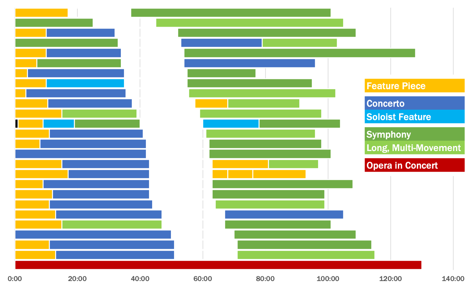
The End Result
Here’s the new version in all its glory - you can now click each piece to see the composer name and title:
I also made another version for fun, where the concerts are sorted by date instead of time to intermission:
I’m looking forward to using this in future posts - I have a couple data sets lined up already. If you think this is interesting, or potentially useful to you, let me know!