Grant Portal Limitations - Intro
This article is Part 1 in the Grant Portal Limitations series.
I strongly believe that if you have a blog, the best way to use it is to write about something incredibly specific, with the hope of enlightening or enriching the lives of the other nine people who care about that thing.
Hence my topic today: in the last several years, many government ministries and agencies who give out grants (I’ll call them “funders”) have transitioned away from using forms made in Microsoft Word or Adobe Acrobat and have started using web portals. As a grant writer, I spend a lot of time using these portals. And they generally suck.
The quality of most mass-market web applications creates a false sense of security. Google Docs is so consistent with saving your work that it takes effort to actually lose something you’ve written. Products like Dropbox have whole teams of user experience designers who work to ensure that their service is intuitive and easy to use. Grant Portals, on the other hand, are usually implemented by government agencies who do not have a lot of people and money to throw towards IT. If a grant portal is reasonably functional and reliable, it’s already doing well.

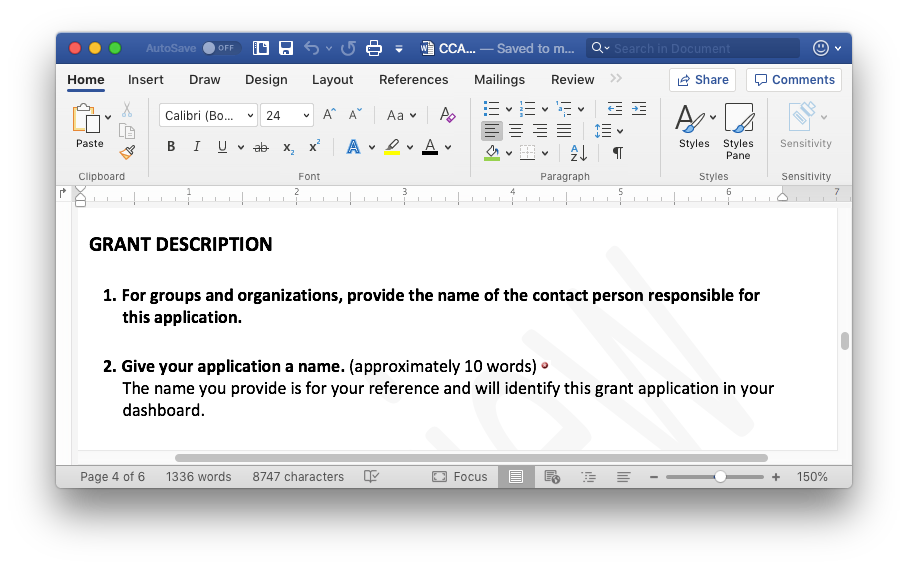
Microsoft Word: still the worst way to write a grant, except for all the others.
Perhaps the biggest problem for a grant writer is that most grant portals are not designed with them in mind. In a lot of ways, the most user-friendly grant application software is still Microsoft Word. No, grant portals are there because they are meant to make life easier for the funder. It’s a lot easier to manage and sort through hundreds (or maybe even thousands) of applications if they’re in a database. It’s the same reason some employers have job application sites where you have to re-write out your resume into their online form. It makes their work simpler, at your expense.
At surface level, I am going to gripe about all the things I find frustrating about grant portals. I have so many gripes, in fact, that I’ve decided to make this a multi-part series. Perhaps it will be enjoyable, cathartic reading if you too write grants. If you work for a funder, or design grant portal software, perhaps it will be useful user feedback.
However, I have a loftier goal in mind. Even if you don’t write grant applications or give out grants, they are an incredibly important part of how our civil society functions. Through grant applications, government gives resources to all manner of people, companies, and non-profits. Grant applications are also one of the most common ways that government communicates with the people it gives money to and holds them accountable. The design of grant portals says a lot about who government gives priority to (and who it doesn’t) and what relationship they have.
Grant portals are also an interesting study in how technology shapes the way we communicate. The tools we use to communicate often change what we say, how we say it, and how it is received. I have lots of interesting examples of that to share with you later in this series.
But before that… on with the gripes!
Articles in the Grant Portal Limitations series:
- Part 1 - Grant Portal Limitations - Intro (Current Page)
- Part 2 - Steps to Writing a Grant: Part I
- Part 3 - Steps to Writing A Grant: Part II
- Part 4 - Formatting Restrictions in Grant Portals